The 'last impressions' (Part 3): Dr No to Thunderball - compared
- Peter Crush
- Mar 14
- 10 min read
Last week we started our a side-by-side comparison of the first and last editions of the Ian Fleming Cape editions. This week we continue the journey – looking at Dr No to Thunderball:

Why is it that key differences often remain hidden in plain sight?
This question could be applied to most walks of life, and certainly couldn’t be better used to explain some of the differences I highlighted last week, when I began comparing the first and last impressions of the Jonathan Cape Ian Fleming hardbacks.
In what is possibly the first detailed look at first and last prints side-by-side, I noted some of the obvious differences as they looked to me.
So, five books down, it’s time to get straight into the next batch.
This week we’re looking at all the books from Dr No (briefly – because the last impression of this book is the only one I do not own), to Thunderball.
The same rules apply as last time – these are the differences that jump out at me, and are particular to the books I have (which might vary from yours).
Also, I’m concentrating on looking at the boards and jackets rather than the minutia of any internal typographical differences.
So… let’s go…
Dr No

I wish I could be more expansive on this – but this is the only ‘last impression’ book that I do not physically actually own (it seems to be very difficult to find!)
Obviously, the big difference is this rather unique – but slightly underwhelming – change to jacket design – a sort of homage to Chopping’s trompe-l'œil style illustrations, featuring the wooden tea-chest wood-grain imagery that we’ve all gotten used to.
Gilbert states that there were only two impressions featuring this cover – the 11th and the final 12th impression of Dr No.
However, one leading collector I know debates whether the 11th impression of Dr No actually exists (he says an example has not ever been seen). He instead suggests that the Cape archives were actually erroneous in listing an 11th impression - and it it certainly not unknown for impressions to be incorrectly chronicled – we’ll look at this in a future blog.
If this is the case, it means that if you see a Dr No with this cover, it’s 99.9% likely to be the ‘last print’. I wish I could say more about this, but can’t! If you have one and want to sell it, let me know!
Goldfinger


Goldfinger is an iconic title, and has one of the best covers of the whole 14-books series in my opinion.
Thankfully, there was no change of cover for this last impression – but what is sadly evident is that the impression of this jacket looks like it's been through the wash, and come out with a significantly bleached look (in parts), about it.
Overall jacket really is very pale indeed, (see left) - very much whiter than the standard beneath it. It almost sort of looks like the ink was running out, and this was the last of the batch before it ran out for good. And yet, this is not the last of the batch because all the last impressions sport a similar anemic, look about them.
That said, the red and green of the rose, and also the yellow for the gold coins are deeper and less subtle.
What’s so odd about this last impression jacket (apart from making the skull look even more ghostly), is that this change so obviously goes against the established trend of the last impressions having a darker, heavier, more full-blooded ink (such as those already identified – From Russia With Love and Diamonds Are Forever).
What’s also apparent are some very obvious differences to the skull image pressed onto the front boards.


The 1st impression – far left is angled differently to the last impression next to it, and it's slightly lower down on the last impression too.
It’s also my contention that the gild gold eyes on the last impression are ever-so slightly different – with the last impression having much more buttery, golden gilt than the light gilt of the first impression.
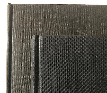
But superseding all these is the biggest difference on show – the very significant difference in the depth of the debossing (the imprint) of the skull itself on the front boards.
If you look at both of the front boards, the extent of the debossing on the first edition is much more definite – with deep troughs to the cloth. By comparison, the last impression boards are barely pressed in at all, showing very little shadow. It’s almost like the boards have barely been pressed at all. This feature is also evident on Thunderball – see later – whose debossing is even more slight than this.

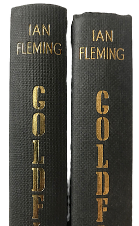


In what is going to be a common observation amongst this tranche of last prints, the last impression of Goldfinger is a little shorter than the first edition, causing the differences shown above to the page block and gilt to the spine. Again, I believe the gilt to the spine on the last print (right) is a yellower gold than the first (like the coins).
But there’s another key feature too. This last print was printed on really awful, low-quality paper (see above right). The yellowness to the paper is not all due to its age. I’m pretty sure this was poor paper stock to begin with. Gilbert specifically notes that the 1978 9th impression (the penultimate impression) was printed on "poor quality paper stock which tends to brown," and I'm pretty sure this carried over to the final 10th impression in 1983. Not only is the paper inferior in quality, it’s thicker too (above middle), making Goldfinger – already the ‘fattest’ book in the series – even fatter!
For Your Eyes Only


This was the only book in 14-book series to have featured an added-on glossy-sheen to the jackets of the first impression. But by the last impression, this additional process (which tended to cause the jackets to yellow over time), was deemed either undesirable or no longer needed, for by the time of the last impression, this step was removed.
For my last impression the paper is very nearly thin card in nature. The paper is heavy (thick), and it soaks up the ink to give it a very obvious matt-effect.
I would say that for this book, we see a return to the trend of having heavier, more defined inking – with the grey wood grain-effect looker much sharper than the almost blurred effect of the first edition.


See how much of the jacket folds over to the front flap on the last impression: top book above
My last impression appears to be a much closer match (height-wise) to the first impression (although I would say it’s fractionally shorter still) – although the DJ spine lettering of the last print is noticeable higher up the spine. Note the level of the ‘Y’ of 'Only', which is jogged up almost a whole letter higher on the DJ's spine.
What is also very noticeable, is that the paper stock used for the final print is thinner (above middle pic), such that it renders the last impression of this title a lot thinner than the first print.
The result is that because the jacket size is the same, more of it wraps around the book, to create a wider front flap. But also, the front flap of the last print also shows a wider wedge of the grey from the front cover wrapping round the board (above right).


Oddly, the back flap is very wide indeed – almost extending to the full width of the book. But more than this, it is completely blank too – bar the ISBN number.
It may seem like a huge wasted opportunity not to publish the standard listing of previous books. But given only six of the 14 books actually made it into the 1980s – thus coming out ‘after’ this last print in 1979 – maybe it wasn’t felt like there were enough in-print books to bother referencing them. For by 1979, only Diamonds Are Forever, You Only Live Twice and The Man With the Golden Gun had a printing in the same year.
Also shown above (above middle) - is the fact that by the time of the last impression, the inside title page is printed in all black ink now. On the first impression - you might recall - the title of the book is printed in red to make it resemble a 'rubber-stamp' on a top secret file/dossier. The final impression is the first edition 'not' to carry the red ink inner title page.
One final observation – it’s very slight, but the ‘white eye’ on the front board looks ever-so-slightly blue-ish to me on the last print… It's hard to show here (above right), the it definitely has a blue tinge to the naked eye.
Thunderball


The first thing you’ll notice is how ludicrously off-colour this book’s last impression jacket looks compared to the first impression. OK, it’s got the same image, but for me that’s where alot of the similarities stop!
If this was a movie (there’s now a whole bunch of people who decide what a film’s colour grading should be – depending on the feel they want to movie to have), then this would be in the more Matrix green-look than anything else, with the saturation levels all much higher (the pics here don’t quite show how these two really differ in real life).
The green really is quite green, and the yellow band to the top of the jacket is less the soft pastel of the first impression, and a more fuller honey-coloured version of it.
But more than this, the DJ paper is shiny/glossy [Gilbert does not mention this], which gives off a very different look and feel. I don’t really like it.


With this book, the difference between the brown cloth of the first impression and the black, finer detailed cloth, of the last impression can most starkly be seen when compared next to each other (see above, right).
Yet again, this last impression is also shorter – as shown by the gilt to the spine appearing lower down on the last impression (see above middle). But this time, also note that the book is not as wide too – meaning the jacket doesn’t really fit very well as it wraps around the book.
For while the last impression’s jacket is better proportioned height-wise (it has been trimmed such that the lettering on the spine of the DJ is in the same place as the lettering on the taller spine of the first impression - see above, left), the length-ways portion of the jacket has not been so carefully thought out. Combined with narrower-width boards it means that when the jacket is folded round it, the portion that forms the front inner flap cuts through the ‘Fleming’ letters on the front, and prevents Fleming’s name from being fully seen on the front of the jacket (as it is on the first impression).


The top (last impression) barely has any sign of debossing compared to the 1st impression
Finally... All these differences are interesting, but they are arguably eclipsed by what you see with the debossing. LikeGoldfinger, the blocking seems to have barely touched the boards – leaving only the thinnest trace of a groove on the front board of the last impression.
I thought Goldfinger’s debossing was shallow, but this is barely-there debossing – with the detail left on this last impression book being almost negative-like feint. You can really hardly see it. Gilbert does not reference either Goldfinger or Thunderball have such discrete debosing.
The Spy Who Loved Me

Last week I promised that there would be a difference on one of the last impression books that I confidently felt most people definitely wouldn’t know about (unless they're a real Cape geek). So, here it is - above.
The Spy Who Loved Me is – I believe – unique amongst last impressions for having a ‘second state binding’ – something normally reserved for first impressions (such as Moonraker, Goldfinger, The Man With the Golden Gun and You Only Live Twice).
Gilbert lists there being a last impression binding (A) ‘with’ the standard silver dagger on the front board, but also a (B) binding ‘without’ the silver dagger.
There is no explanation why two bindings were done, and this is particularly odd for a last print, that would have had a very low production run anyway. But exist it does, and here I have the evidence to prove it. I only very recently (literally in the last month), managed to secure this example without the dagger. Very plain it looks too, and I suspect it’s the least common example of the two.
Given last print production runs were very small indeed, I can only hazard a guess that the un-blocked book is quite rare.


Like other last prints, the printing of the cover is firmer, with more striking definition (see above), and much deeper colours.


Like Thunderball, there is a difference between the colour of the boards - and with this title's the difference being far more obvious – the first impression is much more brown in colour, while the the last impression is black.
In the same way in which the red inking on the title page disappears on For Your Eyes Only, here, the distinctive red endpapers of the first impression have had their day by the last impression. They're gone. Which is a shame - but no doubt by then Cape was in a cost-cuttng mood, with no need to impress readers in quite the same way - especially as there was a X-year gap between the first and last impressions being published.


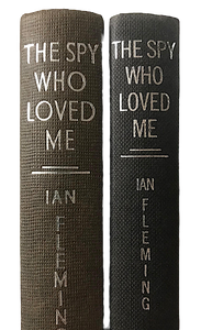


Yet again, this is a last impression that is shorter in height. But while the paper is of a better quality, it’s also quite a lot thinner, meaning the page block bulks to very much more of a slim-line book.
The book is so slim - in fact - that if you look at the middle image above, you can clearly see that the die needed to stamp the silver foil has had to be changed, with the book's title and author's name needing a much smaller, slimmer (and more squashed font) to it to fit across the narrower book. This is unlike For Your Eyes Only which could get away with the same blocking being used on the first and last prints - even though this book was also narrower (see For Your Eyes Only pics again, above).
Stay tuned...!
I hope you've enjoyed this analysis of the middle tranche of James Bond 'last impression' books. Our journey through the 'final impressions' concludes next time, when we compare the final few books...
Comments