Ian Fleming 'last impressions' (part 4): The final four books!
- Peter Crush
- Mar 21
- 6 min read
We're finishing off our series comparing the first and last editions of the Ian Fleming books. This week - On Her Majesty's Secret Service through to Octopussy & The Living Daylights:

Our tour of the Ian Fleming ‘final editions’ is nearly coming to a close!
For the last few weeks, I’ve been sharing images of my Ian Fleming ‘last impressions’ collection – the very final time each classic James Bond title had a hardback printing by Jonathan Cape.
While not all of the James Bon books share the same number of impressions, the final ones for each title are symbolic for literally being the end of an era – where mass-market paperbacks were replacing these ever-more limited run hardbacks.
As part of this series, I’ve specifically shown the first and last impressions of each book together – and in doing so, I think some fascinating differences have been revealed – differences which tell an important story in the changing printing and production of these iconic books.
So, without further a-do, here’s the final set of books – On Her Majesty’s Secret Service through to Octopussy:
On Her Majesty’s Secret Service

Like many of the last impression books shown in this series, this particular title is one of the more obvious ones in terms of differences to the intensity of the colours on the dust jacket.
The first impression I have (underneath), is an unusually clean and bright, and fresh example of this classic book, but compared to the last print on top of it, it looks almost dull and dirty looking [which is definitely is ‘not’].
But that’s the effect that this super-charging of the colours that this last impression book shows alongside it. The inks are demonstrably more vivid – particularly the red ‘rubber-stamp’ effect title (which looks fuller and thicker too), as well as the yellow surrounding it.
The lack of black means the wood-grain effect – which is strong in the first impression – is very subtle, almost blurry in the last impression. But I think this is to its detriment.


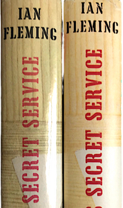
Above: first and last impressions (first impressions on the left, last impressions on the right)
If you look at the last impression above, the coat of arms image looks crisp, and brilliant white, but the rest of the illustration (I feel) looks bleached – the three lower fingers at the moment of the DJ show far less detail, while the creases and lines to the larger hand holding the pencil are significantly dialed back, and less definite.
I think the first impression holds more depth, and detail, while the last impression is more blanched and slightly over exposed-looking.
The colour balance just isn’t right here, it looks like the contrast has been turned up, and it’s lost some detail as a result.


Like some of the other last impressions, the cloth is an equivalent rather than being exactly the same.
My first impression is actually one of the rarer ‘black’ boards variants (rather than sporting the usual brown cloth), but yet again, when compared to the last impression next to it, the last print is another level of blackness.
By far the most interesting difference however, is when we look at the spine of the boards. In this single edition, the last print features ‘O.H.M.S.S’ in gold gilt foil rather than the standard silver. Gilbert doesn’t provide an explanation for why this might be, but it’s a very classy way for this book to bow out.

Less classy, is the fact that (like Goldfinger), the internal sheets are printed on poor quality paper (see pic left). This paper is much more susceptible to browning. Gilbert confirms this too (p368).
All-told I would say the inner sheets of the final impressions all seem to be rather hit and miss. In some of the titles, the paper is very good quality (such as For Your Eyes Only), and very white – but the paper used here looks like cheapness was very much the watchword.
What’s even more odd is that the jacket itself is on very good – almost thin cardboard, high quality quality paper – very white, and it has a glossy, sheen-like finish.
It looks – for all intents – that Jonathan Cape was more interested in making sure the cover looked as bright and fresh as it could be, but less-so the internal sheets.
You Only Live Twice


Bucking the trend for last prints having much more visually-intense colours, I would argue that You Only Live Twice (alongside perhaps The Man With the Golden Gun – see later), is the singular last impression that whose jacket is as close to the original (colour-wise) as can be.
These first and last impression books were printed 15 years apart (1964 vs 1979), but look practically identical, and I wonder whether the delicate pinks of the peony flower and the subtle balance between this and the rest of the design was a colour palette that Cape decided it didn’t (or couldn’t) play around with. I think anything more concentrated would have spoiled the book, and so wisely (I believe), Cape held back.
But have you noticed the big difference yet? Cape clearly couldn’t resist playing with the cover to some extent, and here we see the big difference – the word ‘Fleming’ moving from top right on the face of the jacket, to lower right. For what reason, I know not (Gilbert doesn't even mention it! - did he not notice?), and I don’t think it really works. It makes everything lopsided in my view. But, it does at least give collectors a very obvious clue from 50 yards out that this is a last print, without having to check the colophon.


Like On Her Majesty’s Secret Service, You Only Live Twice is going out in style, and the silver foil on the spine of the boards that we see on the first impression has now turned into a gilt on the last impression – matching the gilt of the Japanese script on the front boards. What I would also add, is that (like Goldfinger before it and Live and Let Die), the gold looks a bit warmer, more bronzy in colour on this last impression.

But has this gilt upgrade come at a price to the rest of the book?
Noticeably the last impression of You Only Live Twice does NOT feature the expected ‘bamboo’ patterned end papers. It was the same for the penultimate (1975) 4th print too.
Plain white have been chosen this time – cheaper yes – but it strips the book of its original charm somewhat.
Once more, this last impression book is also shorter (193mm tall compared to 195 for the first print - as also noted by Gilbert).
The Man With The Golden Gun


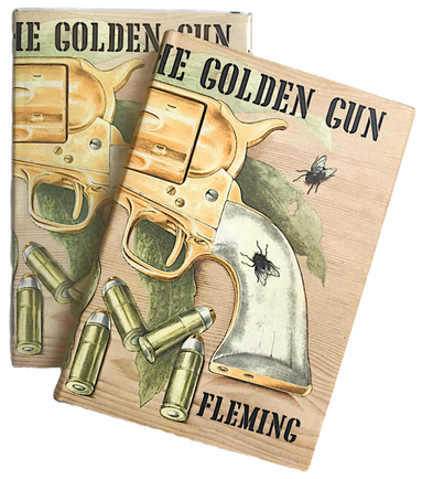


You Only Live Twice and The Man With the Golden Gun are very similar.
Like You Only Love Twice, this last impression is sympathetically printed, and I would say the dust jacket of the last impression is almost identical in saturation and overall look as the first impression.
One again, though, the interesting green end papers are gone by the last impression. In their place the preference is for plain white again.
Production costs will undoubtedly have played a part in this decision, but once again, I feel something is lost slightly through this book being devoid of its standard end papers.
There is a ‘white end paper’ variant in first impression, but this was done more out of necessity than by design. The green sheets literally ran out, and Cape needed to come up with a solution to finish the print run off. When workarounds are done because they have to be done, then it’s fine. But for the last impression, using white end papers was a definite choice that Cape made.


On the last impression of this book, there is - of course - no Golden Gun in gilt on the boards.
Once again the boards look different – darker black again, but this time with a bit more of a dimpled ‘grain’ look, rather than the wavy grain of the first edition. (The gold lettering is more yellowy, but that's more because my first impression has the slightly more scarce copper foil to the spine)
Like many of the previous last impressions, The Man With the Golden Gun is also shorter in height than a first impression and a little smaller width-wise too.
Octopussy & The Living Daylights

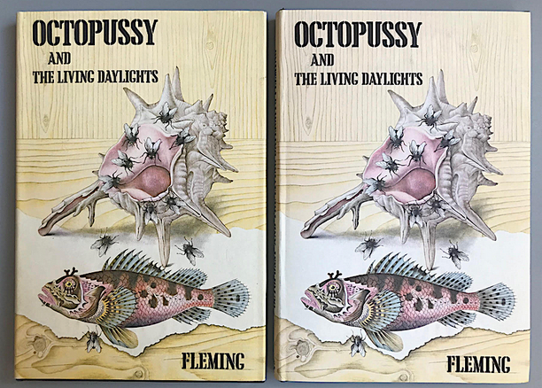


It’s the only book in the James Bond series that holds the accolade for being both the first and last prints in-one.
Poor sales (which saw this book, pre-priced, but still on shelves until the early 1980s), meant this never stood a chance of being reprinted.
But, if you think this means there are no changes, think again. I’ve got a couple of copies of this book, and apart from the standard black boards/brown boards variants that exist within this single printing, take a look at these two side-by-side jackets.
The colours are a lot different. The book to the right (above left), is significantly paler than the one next to it, which has a deeper yellow it. The differences are not explained by sunning. It seems that even within the same print run, there are still very obvious variations in the printed colour.
Thanks for reading this longer-than usual series. I hope you've found some of the information interesting. Normal service on other collecting topics returns next week!
Comments