This week we dive into the detail of how ideas for Ian Fleming Publications' new James Bond hardcover set were conceived - including exclusive images of ideas that didn't make it:

Ian Fleming Publications might well have pushed back the launch day for its brand new set of James Bond books (was supposed to be today - it's now 17th October), but last week we promised you part 2 of our exclusive interview with cover artist, Micheal Gillette.
So, here it is!
Last week we spoke to Michael about how he got the gig to design a new set of Bond covers (for the second time), including the mental processes he went through when thinking about designing a fresh set of covers for existing collectors, but also a new generation of readers.
Having spoke in general terms about how he planned his approach, and what he aimed to bring to the new set, this week he turns to the specifics of actually coming up with ideas for the covers themselves.
As he admits below, they all involved some degree of wrangling, although some he wrestled with more than others, while one or two pretty much came straight away.
He also reveals why fan theories about hidden messages in the designs shouldn't always be believed(!.
Oh, and we haven't forgotten including what I know many of you have been waiting to see - exclusive images of some of the designs that didn't make the cut (but which readers might think should have done!)
Take it away Michael!
Q: OK, last week we focused how you went about thinking about designing Bond. Now that you eventually had to get started, how did you land on your specific ideas? Did you re-read the books, watch the films or something else?
A: “I didn’t watch the films. I did read the books, but I was conscious that I could get too close to the text, so I decided I would only re-read them if/when I got stuck. The process I followed was simply to try and get as many ideas down as I could. I was trying to follow the advice that I now teach students: that your mind will (eventually), give you as many solutions as you ask it for. It’s common in design to have a single idea, and to grip onto to it with white knuckles!”


Left-to-right: The 'survivor'; the 'one that had to be done right'; the one Michael held firm over
Q: Were there specific titles that were harder than others, or needed more ideas?
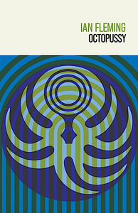
A: “Most took some agony, before the clouds parted! I had some typographic solutions that I liked, but it was decided that they didn’t fit with the set. I think Octopussy [above] was the only survivor of the original 2018 batch of ideas I sent through. Casino Royale definitely had the most treatments – mainly because I think there was a feeling that this was the iconic book that I had to ‘get right’. From Russia With Love was definitely the hardest to pull-off, because for ages the ticker-tape [denoting the Spektor decoding machine], just didn’t look right. But – slightly against my own mantra – this was one title where I really did feel quite strongly that this was ‘the’ idea. IFP had actually picked a different treatment, but I was pretty definite about the ticker tape one, and they were kind enough to trust me to run with it."

"Other times, an idea could come out of something people mentioned.
"For example, IFP’s Simon Ward (IFP publishing director), happened to mention to me that You Only Live Twice is often referred to as the ‘Shatter novel’ – and that idea stuck.
"I found it visually interesting – with a ‘shatter’ image representing violence. [see left]. And I also thought it succeeded in terms of it being able to work as a wood block. Also, I wanted to have a villain on the cover, so this was a good way of sneaking one in!”
Q: You’re probably aware that fans read a lot into covers – did you know some theories suggest the glass-shattered villain image for You Only Live Twice is a reference to shattered windscreen from the bullet that killed Tracy at the end of On Her Majesty’s Secret Service?

A: “I’m always fascinated by what people read into my illustrations, and that they have the care to do so. But that’s a new one on me! In many ways that sort of sums up the beauty – but also the difficulty of doing Bond – because people have different mimetic desires, and as an artist, it’s hard to land on everyone’s personal point of entry to the franchise. I’ve heard other people say that the cover for Live and Let Die harks to the ‘dots’ imagery of the opening credits of Dr No, the film. The less interesting reality is that I wanted to show the gold coins as simplified dots, and because a photographic treatment originally used for the skull didn’t quite work, the dots were carried through into the skull as well. Maybe I should have said, ‘yes, it totally references Dr No’ to make me look clever!”
Q: I think these designs really are clever – Golden Gun is inspired, the way the girl silhouette creates the trigger.

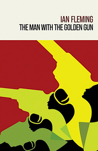


Details: Golden Gun: Girls on the cover; life-sized bullets on the back; dots theme continued
A: “That’s very kind, yes, I’m pleased with that one. This was one of the covers [above left] that was pretty much done in a single take. But if I can indulge a bit, there are some other deliberate touches that I have included that the casual viewer might not spot.

For instance, the ‘dots’ were a deliberate motif that I chose to use across many of the titles – such as in Moonraker [above right], where I wanted to reduce imperiled Britain to just a few dots on a mission-control style screen.
The dots used for the spider’s eyes [left] on Dr No were echoed in the joints on Dr No’s mechanical hand. The bullets on the back cover of The Man With The Golden Gun (above middle) are real-sized bullets, so when you hold the book they could be slipping through your fingers. There are lots of small details like this.”
Q: What are the various IPF office favourites?
A: “I’m not sure I know of exact favourites. I know Corinne Turner [managing director at IFP] likes From Russia With Love, while Simon has previously said his favorite is Moonraker.”
Q: For people who don’t know book publishing, there’s so much going on isn’t there – can you give us an insight into this?
A: “Oh yes, absolutely. There are so many things that go on behind the scenes, which is really why IFP have to be applauded for stepping up and becoming publishers. Late in the day, for instance, the book format changed, to more of a pillar-boxed proportion. Originally, the images sat inside a square box with a white border all the way around. But the size change meant this didn’t look right, with the crease of the spine interfering with the vertical side of the box, throwing your eye out. The image would have felt cramped, and so the decision was taken to make the images full bleed, with just a white title at the top. That was in late July! But I think the finished books are actually all the better for it. These are the things that go on in the background that you wouldn’t necessarily think about.”
Q: Was there always ‘not’ going to be a dust jacket?
A: “Yes! I know book collectors get very precious about dust-jackets, but I really don’t like them. They just get in the way. I’m always fixing them with tape. The decision not to have jackets was there right from the start.”
Q: You’ve shown us a sneaky-peak at some of the designs that didn’t make it – can you talk us through them:
A: "Yes, there were many images that didn’t make it. [The below were as per the original square-with white border format]:

"Some where just a bit too conceptual – such as this one [above left] for Casino Royale – showing a side-on view of a stack of casino chips. It would look great as a print, but too oblique as a book cover. I really liked an image I did for Casino Royale [above middle] – a silhouette of a women created by cards on a baize table, but when I showed it to my wife, she just saw scattered cards!"

"There were some I liked for Live and Let Die [above], with the snakes, and the Jamaican flag colours, and these were contenders for a while, but the skull won out."

"For You Only Live Twice I had a two-state style image –“twofers” – showing the rising sun and Union Jack combined, or layered like poster tear-throughs. But again, I don’t think these really captured what we wanted."


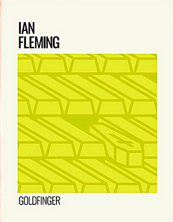

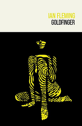
Left-to-right: An early treatment for Dr No; an early treatment for Goldfinger, and the final one
"I thought this image for Dr No [above] was a strong one but didn’t pass.
"This was a very early one for Goldfinger, but then the second version occurred in a flash, and it’s one of my personal favourites.”
Q: You say Casino Royale had the most roughs, for obvious reasons. Was this the pressure book?
Q: "It was the one we had to get right. But it was also the one that had the most potential imagery, so it kind of presented itself with the most options.


Left-to-right: Mind the plumbs! Michael's in-joke.
Back cover art: The carpet beater made it to the back cover on Casino Royale, while an original idea for Thunderball was used on its back cover
"I remember Simon saying he really wanted to get the carpet beater into Casino Royale somehow – but I didn’t feel this was something that would say ‘Casino Royale.’ In reply – as a joke – I sent him an image of a fruit machine, showing two ‘plums’, and then a 7. I think that got a laugh back at base!
"The process of going back and forth with ideas was helpful though. Some of the stray concepts made it to the back covers [See above middle and above right]. The carpet beater, for example, did find its place. The back covers were a great spot for some extra iconography – for instance using the image of the Geiger-counter camera on the back cover of Thunderball. When reading the books, I noted the lack of gadgets. I think that it’s really the only one, so I wanted to include it.”
Q: I can’t let you go without fans asking why you did a spider on Dr No – it is in the movie, but it’s a centipede in the book. Were your referencing the movie?
A: “Funnily enough, I was actually referencing the end chapters, where Bond is thrown into an assault course of tunnels, and I think spiders were part of that.”
Q: Bond doesn’t feature on any of the covers – was there a specific reason for this?
A: “It didn’t even cross my mind to include Bond! I think people should have their own interpretation of him. Maybe I could have done an abstracted version. Hmm, you’ve got me thinking…”
Q: Well, pretty soon these books will be in people’s hands. What do you want people to think about when they pick one up?
A: “I’m happy when anyone pays attention to my work, but with this set in particular – with the gestation they’ve had – that’s far beyond what is normal for a set of books – I’d really love people to appreciate the amount of love I’ve put into them. I hope people can see that I made the effort, to make something – a book – into a beautiful object. Hopefully this sentiment will prevail. I’ve loved doing them, and an eager for them to be in people’s hands now.”
PS Michael will soon be selling prints of the new cover designs.
To find out more click here
コメント